It's Saturday night, and someone is sitting on the couch with their phone, thinking about trying a church tomorrow. They search, tap your link, and look at your homepage for a few seconds. Before they've read a word about what you believe, they've already started answering a quieter question: is this place for someone like me?
I wrote about that Saturday-night search in Why Your Church Website Is Costing You First-Time Visitors. This post zooms in on the homepage itself.
In my years on staff at Orchard Hill Church, I've heard plenty of comments about our website. Some were about the design, some about the content, and some were ideas for making it better. The ones I love most are about how easy it was to find something.
We have a pre-registration form for Kids Ministry on our site, and I've seen families show up for their first visit already in the system and ready to go. Check-in is smooth for them, and our ministry leader gets to focus on welcoming the family and their kids instead of collecting names, phone numbers, and birthdays.
That's what a church website is for. A beautiful site doesn't help much if someone can't find what they came for, and for most visitors, that search starts on the homepage.
This is the first part of a series walking through the Church Website Checklist, one category at a time. The first category is First Impressions, and it has five items.
1. A headline that says more than your name
The visitor already knows your church's name. It's how they found you. So when the biggest words on the homepage are "Welcome to Grace Church," that space isn't telling them anything new.
Your headline is the one sentence most people will read. Use it to say who you are and who you're for, in words a guest would use. "A church family where everyone has a seat at the table" tells someone more in five seconds than a name and a logo can.
Watch for a few common versions of this problem: the church name repeated as the headline, a slogan that could belong to any church, or a rotating slideshow where the real message is on slide three. Plenty of visitors never wait that long.
2. Real photos of your people and your space
Photos answer the questions people won't ask out loud. What do people wear? How big is it? Will my kids be okay? Will I stand out?
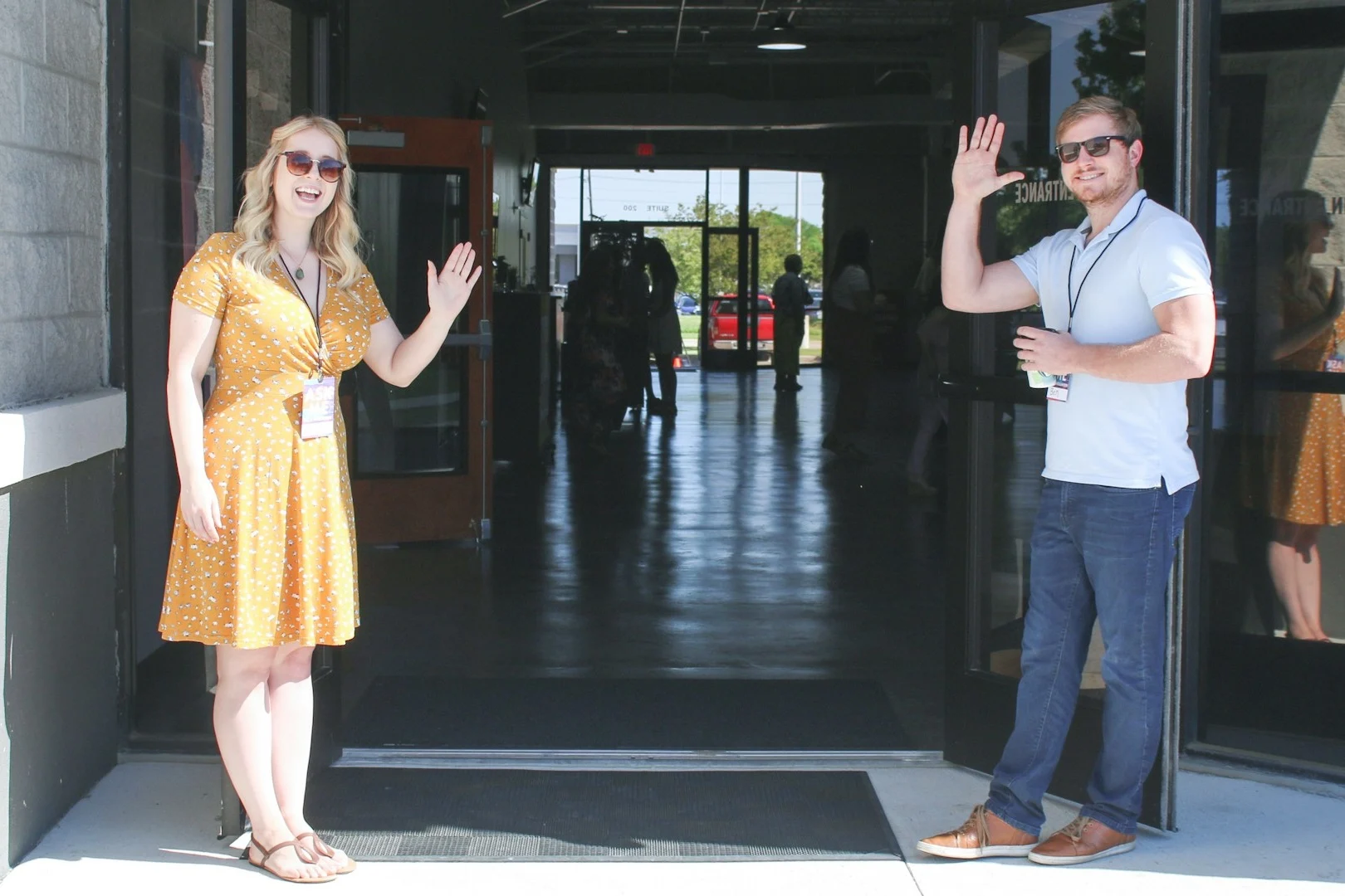
A stock photo of smiling strangers can't answer any of that. Your own photos can: people talking in the lobby, the front entrance a guest will walk through, the kids' area, worship from the back of the room, the way someone sitting in the last row would see it.
You don't need a professional shoot to start. One Sunday with a volunteer photographer and a short shot list will give you better homepage photos than any stock library.
3. A clear next step within about 10 seconds
When someone lands on your homepage, they should be able to tell what to do next within about 10 seconds. If the next step isn't obvious, a lot of people won't go hunting for it. They'll just close the tab.
For most churches, that next step is one button near the top, usually "Plan a Visit," with your service times and address right beside it. Everything else, like events, sermons, and ministries, can come further down the page.
The usual problems here are too many buttons competing for attention, a "Learn More" that doesn't say what you'll learn, and service times that only appear in the footer. Part 2 of this series covers the Plan a Visit page itself.
4. A site that looks intentional
Visitors notice consistency even when they couldn't tell you why. A homepage with four fonts, a few different button styles, and colors that change from section to section can feel pieced together, and people wonder if the church is too.
This doesn't need to be a design project. Pick two fonts at most and a small set of colors, write them down, and use them the same way everywhere. Use one button style on every page, and the whole site will start to feel cared for.
5. Fast on a phone
A lot of first visits to a church website happen on a phone, often on cellular data in a car or on a couch instead of on office Wi-Fi. If your homepage takes more than about three seconds to load, some people are gone before they see it.
The usual causes are large photos that were never compressed, a background video, and too many embedded widgets or pop-ups. You can check your own site with Google's free PageSpeed Insights tool. Look at the mobile score. If it's in the red, start with the photos on your homepage. Part 5 of this series goes deeper on the technical side.
Check your own homepage
Here's a quick check you can do today:
- Open your homepage on your phone, using cellular data instead of Wi-Fi.
- Show it to someone who has never been to your church for five seconds, then ask them who the church is for and what they'd do next.
- Run it through PageSpeed Insights and look at the mobile score.
- Count the buttons you can see before you scroll. If there are more than two, there are too many.
The one fix to make first
If you only change one thing, change the headline and the next step together. They're the first things a visitor sees, and fixing them is usually a text edit, not a redesign. Replace your name with a sentence about who you are and who you're for, then put one clear "Plan a Visit" button right under it.
What comes next
The person on the couch on Saturday night only gives your homepage a few seconds. If those seconds tell them who you are and what to do next, they'll take the next click, and maybe walk through your doors the next morning.
The Church Website Checklist covers all seven categories, so you can score the rest of your site in about ten minutes. Next in this series: the pages every church website needs.
Get new posts by email
Practical ideas for church websites and digital ministry, sent when a new post goes up.