Picture someone in your town on a Saturday night. Something has been stirring for a while, and tonight they finally decide to try church. They pull up your website on their phone.
They aren't comparing doctrinal statements. They want to know a few simple things: What time do I show up? Where do I go when I get there? What do I do with my kids? Will I stick out?
If your site answers those questions in the first few seconds, you've made it easier for them to come. If it doesn't, many of them will close the tab and try again some other weekend, or not at all.
The questions a first-time visitor is asking
After years of managing a church website, I've noticed that the questions people bring rarely change:
- What time are services, and how long do they last?
- Where is the building, and where do I park?
- Which door do I walk through?
- What happens with my kids?
- What do people wear?
- What is the service actually like?
None of these are deep questions. Someone who has never been to your church needs to picture Sunday morning before they'll commit to it. Every question your site leaves open is a reason to wait.
Where church websites go wrong
Most church websites aren't bad. They're built for the people who already attend. That's understandable, since members are the ones who use the site every week. But it means the homepage often reads like a bulletin.
A few patterns come up again and again:
Announcements fill the homepage. The men's breakfast, the budget meeting and the fall retreat take up the space where a visitor is looking for service times.
Service times are hard to find. They're in the footer, in a PDF, or on a page called "Gatherings" that a newcomer wouldn't think to click.
The language is for insiders. Names like "The Loft," "Kidz Zone" or "Rooted" mean something to your members. To a visitor, they're puzzles.
The photos aren't of your church. Stock photos of smiling strangers tell a visitor nothing about what your people and your space look like.
The site is slow or awkward on a phone. Your visitor is probably on their phone. If the menu is hard to tap or the page takes too long to load, they won't wait.
There's no clear next step. A visitor finishes the homepage and still doesn't know what to do.
What to put on your homepage instead
Your homepage has one main job for a first-time visitor: help them picture coming on Sunday.
That means service times and your address near the top, where they can't be missed. It means a short headline that says something about who you are, beyond your church's name. It means real photos of your people and your building. And it means one obvious button, something like "Plan a Visit," that takes them to the rest of the answers.
Announcements still have a place. They just belong further down the page or on an events page, where members will find them anyway.
Build a Plan a Visit page
A Plan a Visit page is one of the most useful pages a church can add for newcomers. It's where you answer every question from that Saturday night list in one place:
- Service times and how long they run
- Your address, with a map and parking details
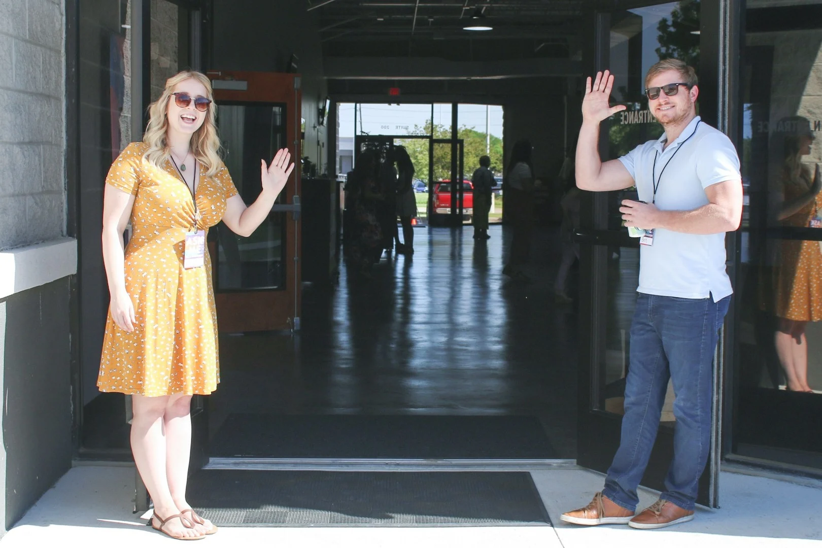
- Which entrance to use, and who will greet them
- What happens for kids, from check-in to pickup
- What people usually wear
- What to expect in the service itself
At Orchard Hill, where I've managed the website since 2017, there's one more question to answer first: which campus? We're a multi-site church, so we try to make it as easy as possible for people to find the campus closest to them. Every campus page puts the service times and address at the top, explains what to expect in the service, and gives visitors a way to contact the campus leader directly with any questions. Almost all of our next steps start online, so someone can take a first step the moment they're ready. Each one is designed to lead to an in-person connection, because the website's job is to help people find community at church.
Write this page the way you'd talk to a neighbor who asked about your church. If you can, add a simple form so visitors can let you know they're coming. It gives your welcome team a chance to look out for them.
Where your beliefs belong
None of this means your statement of faith doesn't matter. It does, and plenty of people will want to read it before they visit.
It just isn't the first question most visitors are asking. Give your beliefs their own "What We Believe" page, link it from the menu and from your Plan a Visit page, and let people find it when they're ready. The visitor who cares about it will look for it. The visitor who doesn't yet shouldn't have to read through it to find your service times.
See how your site measures up
Every one of these problems can be fixed, usually without rebuilding your whole site.
If you'd like to see where your website stands, I put together a free Church Website Checklist. It walks through 40 items across seven categories, including first impressions and the pages every visitor looks for. It takes about ten minutes, and you'll know exactly where to focus first.
And if you'd rather have a second set of eyes on it, I'm happy to review your homepage for free.
Get new posts by email
Practical ideas for church websites and digital ministry, sent when a new post goes up.