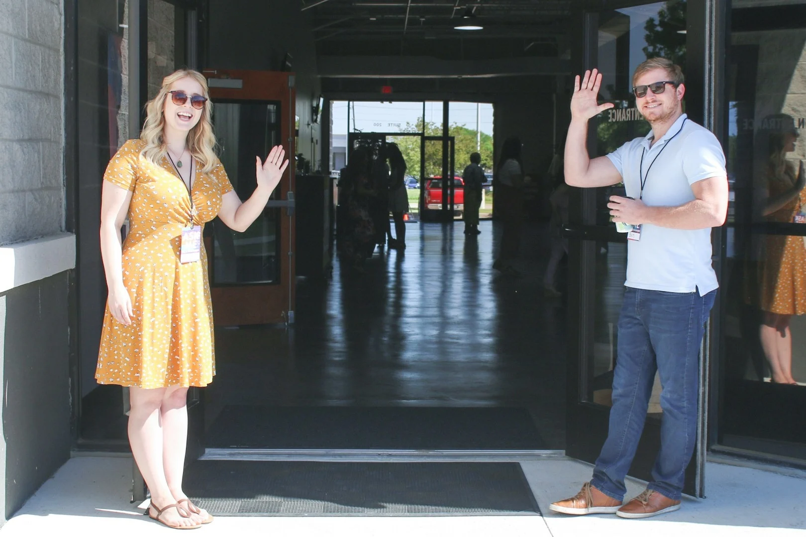
Your website is now the front door of your church. When most people look for a church to visit, they start on Google. They search for churches nearby, check the listings on the map, and click through to a few websites. Along the way, they’re trying to decide whether they could see themselves as part of that church.
I recently spent some time looking closely at 25 church websites, all within about half an hour of my home north of Pittsburgh. Most were Presbyterian, with Alliance, Assemblies of God, Methodist, Lutheran, Baptist, and nondenominational churches in the mix. Some were small congregations with a part-time office. A couple ran more than one campus.
I wanted to know what a first-time visitor would run into, so I looked at each site the way a guest would: on a phone, looking for service times, a way to visit, and a way to get connected. I also searched for each church in Google and in online directories to see how it showed up.
Two of the churches had no website I could find, and I couldn't load or review two others. That left 21 sites to look at closely.
Small problems that had gone out of date
I expected to write mostly about dated designs. A few sites did look their age, but the problems that would stop a visitor were smaller and easier to miss.
Seven of the 21 had something clearly out of date on the homepage or in the main menu: a concert from two years ago still featured at the top, a summer office-hours notice still up in late October, a "2026 Bulletins" menu item that opened last year's bulletins, an events section saying there was nothing coming up.
Another seven had a contact link or next-step button that was broken or went somewhere unexpected. One "Contact Us" link pointed back to the homepage. An email link opened an error page. A "Join Us This Weekend" button took people to a form for leaving a Google review. Four sites had typos on the homepage or in the menu, one of them in the name of the church's own town.
None of these issues require a redesign, and most take five minutes to fix. A website gets built and launched, and then it slowly drifts while everyone is busy with ministry. Nobody decided to leave the summer hours up; taking them down just never made it onto anyone's list.
Visitors had to hunt for the basics
A first-time guest mostly wants to know when services are, where you are, and what to do next. Three of the sites didn't show service times on the homepage at all, so you had to click into another page to find them. At least five had no Plan a Visit page, or a homepage with almost nothing on it beyond an address.
Seven made giving harder than it needed to be. Some had no Give button on the homepage. Others had two giving links that went to two different places, or a giving button someone had copied out of an email, which could stop working at any time. One church asked people to set up recurring giving by printing a form, attaching a voided check, and mailing it in.
Being found
The website is only half of how people find a church. The other half is Google, Apple Maps, and the directories that feed them.
Five churches had listings that sent people to an old church name, an old address, or the wrong website. One directory listing pointed to a completely different church nearby. One site was telling Google not to list it at all, probably a setting left over from when the site was being built. It was keeping the church out of its own search results, and it's a one-line fix. And for the two churches without a website, anyone who searches for them will only find directory pages the church doesn't control.
Most sites weren't connected to anything
Only 7 of the 21 sites visibly linked to a church database like Planning Center, Breeze, or CCB. On the rest, a visitor who wanted to sign up for something usually found an email address or a phone number instead of a form.
Plenty of smaller churches don't need a church database yet. For the ones that have one, though, the website is the front door to it. When "Give," "Register," and "Join a Group" go straight to the right form, people take the next step. When those buttons lead to an email address, a lot of people don't.
The platform didn't decide much
The sites ran on Wix, Weebly, WordPress, SnapPages, and a handful of church-specific builders. One of the strongest sites I saw was built on Wix, and some of the most broken links I found were on custom WordPress designs. The sites that worked well were the ones someone was clearly keeping up.
What I'd fix first
If your church's website sounds like any of this, here's where I'd start:
- Look at your homepage on your phone, the way a guest would. Can you find service times, the address, and a way to plan a visit without scrolling or clicking around?
- Click every button and link in your main menu and footer, especially "Contact," "Give," and anything that says "Plan a Visit" or "I'm New."
- Take down anything past its date, like old events, seasonal notices, and last year's bulletins.
- Search for your church in Google and Apple Maps, and check the name, address, phone number, website, and service times.
- Give one person the job of checking all of this each season. Fall kickoff, Christmas, and Easter are natural times to look.
What the sites got right
Nearly every church I looked at had good things to show on its website: youth ministries, community events, mission trips, livestreams, a concert series. The ministry was happening, even where the website hadn't kept up with it.
Almost nothing I found needed a new website. It needed someone to look closely once, and then keep checking. If you'd like to see where your own site stands, the Church Website Checklist walks through 40 items in about ten minutes.
Get new posts by email
Practical ideas for church websites and digital ministry, sent when a new post goes up.